Adaptive and Responsive Web Design Services


Enhancing Accessibility Through Responsive Design

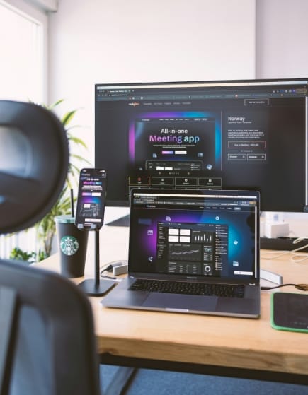
In today's digital era, having a responsive website is essential for success. At Samosys, we specialise in creating stunning and functional websites that adapt seamlessly to any device or screen size.

Our team combines expertise, creativity, and cutting-edge technology to deliver bespoke solutions personalised to your specific needs. Whether you're starting from scratch or looking to revamp your existing site, partnering with us ensures a captivating online presence that engages your audience effectively.

User-Centric Design

We focus on creating designs that provide an intuitive and engaging user experience. By understanding user behaviour and preferences, we craft interfaces that are not only visually appealing but also easy to navigate. Our goal is to ensure that users find what they need quickly and enjoy their interaction with your site.

Mobile-First Strategy

We prioritise mobile usability to ensure a solid foundation for all devices. Starting with mobile design, we ensure that your website performs excellently on smartphones and tablets before scaling up to larger screens. This strategy guarantees that your website is accessible and user-friendly, no matter the device.

Image Description

Adaptive Layouts

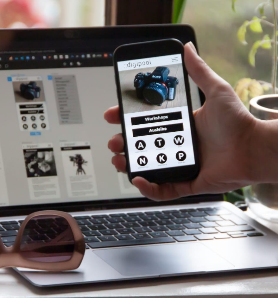
We utilise flexible grids and layouts to adapt to various screen sizes. Our responsive design approach ensures that your website looks and functions perfectly on any device, from desktops to smartphones. By using adaptive layouts, we provide a seamless user experience that adjusts to different screen dimensions and orientations.

Image Description

Performance Optimisation

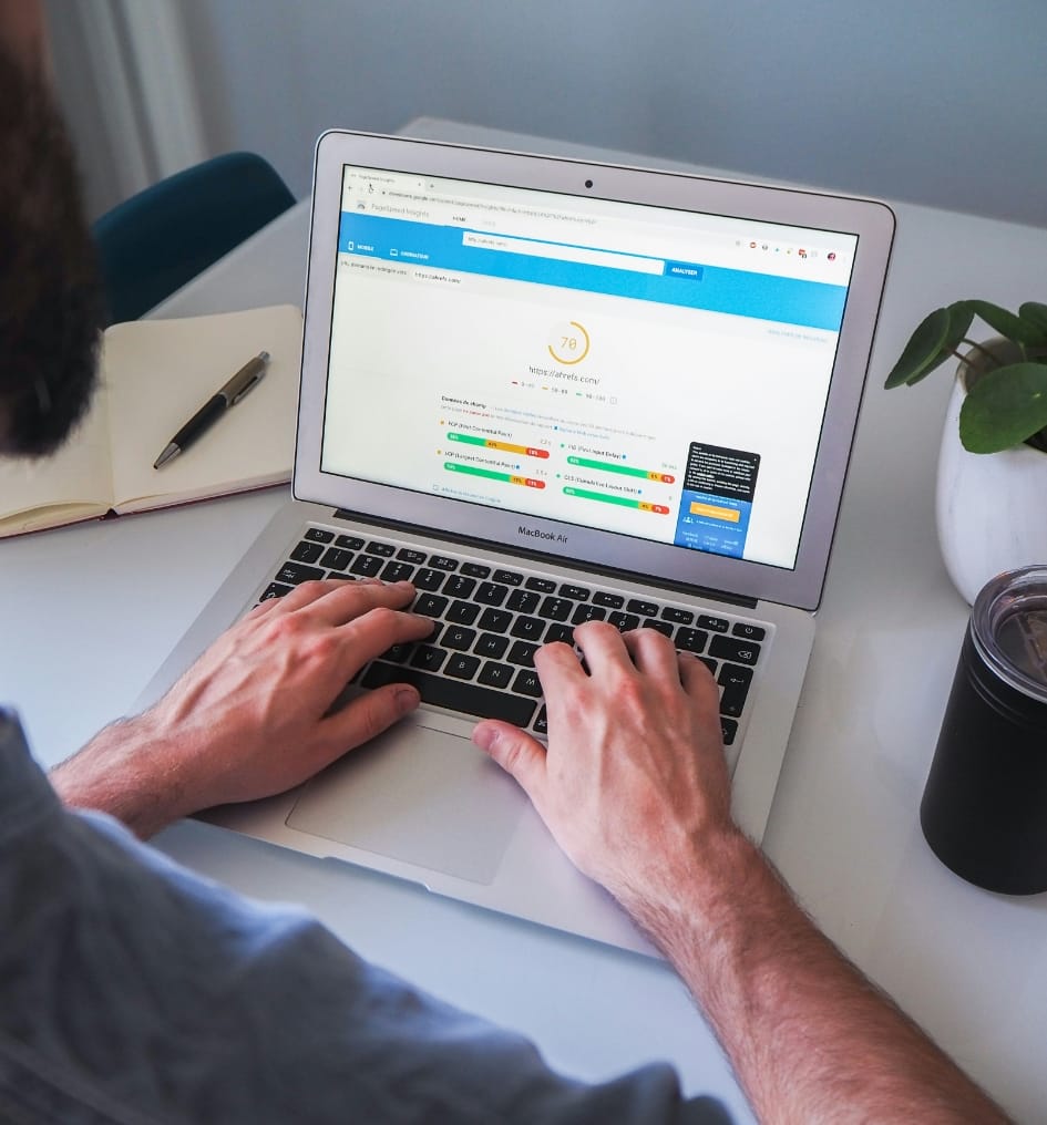
We ensure fast load times and smooth interactions for an optimal user experience. Performance is a key factor in user satisfaction and search engine ranking, so we optimise images, scripts, and other elements to make sure your site runs efficiently. This not only improves user engagement but also boosts your website’s overall effectiveness.

Image Description

Cross-Browser Compatibility

We guarantee consistent functionality and appearance across all major browsers. Our rigorous testing process covers a wide range of browsers and devices to ensure that your website performs reliably, providing a uniform experience to all users regardless of their preferred browser.

Image Description

Accessibility Focus

We design with inclusivity in mind, making websites accessible to all users, including those with disabilities. By following the latest accessibility standards and guidelines, we ensure that your site is usable by everyone, providing features like keyboard navigation, screen reader compatibility, and appropriate colour contrasts.

Image Description

Service Offerings

Custom Responsive Websites
Personalised websites designed to meet your specific business needs. We create unique, responsive designs that reflect your brand identity and cater to your target audience. Our custom solutions ensure that your website stands out and delivers a seamless experience across all devices.
E-commerce Solutions
Responsive design for online stores to enhance shopping experiences. We build e-commerce platforms that are not only visually appealing but also easy to navigate and use on any device. Our solutions include secure payment gateways, intuitive product displays, and streamlined checkout processes to improve user satisfaction and drive sales.
Landing Pages
Optimised, responsive landing pages to boost conversions. We design targeted landing pages that are focused on driving specific actions from your visitors, whether it’s signing up for a newsletter, downloading a resource, or making a purchase. Our landing pages are optimised for speed and usability, ensuring high conversion rates.
Website Redesign
Transform your existing site into a responsive, modern platform. We take your current website and revamp it with a fresh, contemporary design that performs flawlessly on all devices. Our redesign process enhances usability, updates your site’s aesthetics, and improves overall performance to keep your visitors engaged.
Performance Optimisation
Enhance your website’s speed and functionality for a better user experience. Our performance optimisation services focus on reducing load times, optimising images, and streamlining code to ensure your site runs smoothly. A faster website not only improves user satisfaction but also positively impacts your search engine rankings.
Ongoing Maintenance and Support
Ensure your website remains up-to-date and secure. We offer continuous maintenance and support services to keep your site running efficiently. From regular updates and security checks to troubleshooting and enhancements, our team is dedicated to providing you with reliable, ongoing support.

Our Process

  01
Planning and Research

Before diving into design and development, it's crucial to thoroughly plan and research your project. Identify your target audience and the devices they use. Research industry standards and analyse competitor websites to gather insights. Define clear goals and objectives for your website to guide the design and development process.

  02
Content Strategy

A solid content strategy is the backbone of any successful website. Outline the hierarchy of your content to ensure it's organised effectively. Determine which content is essential and prioritise its display on different devices. By planning your content strategy early on, you can ensure that your website communicates your message effectively to your audience.

  03
Wireframing and Prototyping

Wireframing and prototyping allow you to visualise the layout and structure of your website before diving into full-scale design and development. Create wireframes to outline the basic elements and layout of each page. Develop prototypes to demonstrate interactions and responsiveness, providing stakeholders with a tangible representation of the final product.

  04
Design

The design phase is where your website starts to take shape visually. Develop a visual design that aligns with your brand identity and resonates with your target audience. Design for multiple screen sizes, considering breakpoints for different devices such as desktops, tablets, and mobile phones. A cohesive and visually appealing design is essential for creating a positive user experience.

  05
Development

During the development phase, your website comes to life through code. Write HTML, CSS, and JavaScript code based on the design specifications. Utilise responsive web design frameworks like Bootstrap or Foundation to ensure consistency and efficiency across different devices. Focus on accessibility and web standards to create a website that is usable by all users.

  06
Testing

Testing is a critical phase to ensure that your website functions as intended across various devices and browsers. Test the website on different devices and screen sizes to check for responsiveness and compatibility. Identify and fix any bugs or issues that arise during testing to ensure a seamless user experience.

  07
Optimisation

Optimisation is key to improving the performance and usability of your website. Optimise images and code to reduce loading times and improve site speed. Implement performance enhancements such as lazy loading and caching to further enhance the user experience. By optimising your website, you can create a faster and more efficient browsing experience for your users.

  08
Launch

Launching your website is an exciting milestone, but it's essential to ensure everything is in place before going live. Deploy the website to the live server and perform final checks to ensure everything is functioning correctly. Monitor the website closely after launch for any post-launch issues and address them promptly to maintain a positive user experience.

  09
Maintenance

Once your website is live, ongoing maintenance is necessary to keep it running smoothly. Regularly update the content to keep it fresh and relevant. Monitor analytics to track user behaviour and make data-driven improvements to your website. Address any bugs or issues that arise promptly to ensure a seamless user experience and maximise the effectiveness of your website.


Benefits

Improved User Experience

Experience seamless navigation and readability across devices. Our responsive design ensures that your website looks and performs consistently well, regardless of the device your visitors are using. This enhances user satisfaction and encourages longer browsing sessions.

Higher Search Rankings

Achieve better SEO performance with a mobile-friendly design. Search engines prioritise mobile-friendly websites in their rankings, which means having a responsive design can positively impact your search visibility and drive more organic traffic to your site.

Increased Engagement

Encourage enhanced user interaction and lower bounce rates. With a responsive design, visitors are more likely to engage with your content and explore multiple pages of your website. This leads to increased time on site, higher conversion rates, and ultimately a more successful online presence.

Future-Proof

Ensure your website remains adaptable to new devices and screen sizes. As technology evolves and new devices emerge, a responsive design provides flexibility and scalability, allowing your website to continue delivering a seamless experience to users, regardless of changes in the digital landscape.

Cost-Efficiency

Save time and resources with a single, responsive website that caters to all devices. Instead of managing multiple versions of your site for different screen sizes, a responsive design streamlines maintenance and updates, reducing overall costs in the long run.

Competitive Advantage

Stand out from competitors with a modern, responsive website. In today's digital era, users expect websites to be mobile-friendly and easy to use on any device. By providing an exceptional user experience, you can differentiate your brand and gain a competitive edge in your industry.


Why Choose Us

Expertise and Experience

With years of experience in web design and development, our team brings a wealth of knowledge and skills to every project. Our extensive background ensures that we can handle a variety of challenges and deliver high-quality solutions personalised to your needs.

Client-Focused Solutions

We understand that each client is unique, which is why we offer customised services designed to meet your specific requirements. Our approach involves close collaboration with you to ensure that the final product aligns perfectly with your vision and goals.

Proven Track Record

Our portfolio of successful projects and satisfied clients speaks volumes about our capabilities. We have consistently delivered exceptional results, earning the trust and loyalty of our clients. You can count on us to bring the same level of dedication and excellence to your project.

Cutting-Edge Technology

Staying ahead of the curve is crucial in the ever-evolving field of web design and development. We utilise the latest tools and technologies to create innovative and efficient solutions. Our commitment to using cutting-edge technology ensures that your website is not only modern and visually appealing but also performs optimally across all devices.


Frequently Asked Questions

Responsive web design is an approach to web development that ensures a website looks and functions well on a variety of devices and screen sizes, from desktops to tablets to smartphones. This is achieved through flexible layouts, images, and CSS media queries, allowing the website to adapt dynamically to the user's device.

Responsive design is crucial because it provides a seamless user experience across all devices, which can significantly enhance user satisfaction and engagement. It also improves your website's accessibility, helps with search engine optimisation (SEO), and ensures that your site is future-proof as new devices and screen sizes emerge.

The time it takes to develop a responsive website can vary depending on the complexity of the project, the number of pages, the features required, and the availability of content. On average, a basic responsive website can take anywhere from 4 to 12 weeks to design and develop. More complex websites with advanced functionalities can take several months.

Yes, we can redesign your existing website to make it more responsive. This process involves evaluating your current site, identifying areas that need improvement, and implementing responsive design techniques to ensure that your site works well on all devices. We'll work closely with you to maintain your brand identity and improve the overall user experience.

A responsive website is designed to work seamlessly across all major platforms and devices. This includes desktop computers, laptops, tablets, and smartphones running on various operating systems such as Windows, macOS, iOS, and Android. Our goal is to ensure that your website delivers a consistent and high-quality user experience, regardless of the device or platform your visitors are using.

See what our clients have to say

About our responsive web design services. Our testimonials reflect the quality, dedication, and satisfaction our clients experience throughout their project journey.

This team really saved me a lot of time so am grateful for their work. A+++

Hansel Ke

Singapore

Best team I’ve worked with so far. Very knowledgeable, efficient, friendly, have great ideas and are clear about what we want. We have completed dozens of projects together and I see many more to be delivered in future.

Bryan Bjerke

U.S

Abby is very knowledgeable and a good contractor. He and his team has been supporting our various development needs for over 3 years now. Their work is excellent and on time.

Suky Gill

London, GB

Perfect team for your mobile apps development. I am very grateful to have found them. Their pay rate is a little high, but it is appropriate for the quality of work and efficiency they deliver every time.

Nisha Pattison

San Diego, US

The work was completed swiftly without much instruction on my end. I love that I can give someone an idea and they have the confidence and ability to run with it on their own. Would definitely work on more apps with.

David Hamer

Cumbria, GB

Best team I’ve worked with so far. Very knowledgeable, efficient, friendly, have great ideas and are clear about what we want. We have completed dozens of projects together and I see many more to be delivered.

Joél Contreras

Denver, US

Their team is knowledgeable, responsive and committed to supporting our initiatives, making them invaluable partners, A full digital marketing service that has not only increased our visibility, but has increased our inbound lead generation.

Todd Peterson

Canada

We've been working with Samosys Technology now for 2 years and we've found their digital marketing services to be exceptional. Their digital marketing consultants are leading the way in social media and SEO & they are getting a great return on investment for their clients.

Jill Casey

New York, US

Samosys mid 2016 for their experience in paid search. I have been impressed with their interest and curiosity in our business, their range of skills and that they’ve delivered campaigns which have truly improved our ROI

Kevin J. Ross

Fairfield, U.S

No image found

Conclusion

Choosing us means leveraging our extensive expertise and experience in web design and development. We offer client-focused solutions personalised to meet your unique needs, utilising cutting-edge technology to ensure your website is modern, efficient, and performs optimally across all devices. Our proven track record of successful projects and satisfied clients speaks for itself.